
Jack London once said “Show me a man with a tattoo and I’ll show you a man with an interesting past.” With my needle phobia, the only way I’ll ever get tattooed is with Photoshop. Here’s a tutorial on how to add “an interesting past” to a photo.
Step 1
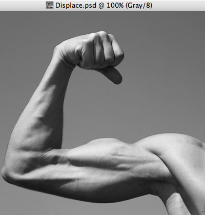
Open your image, select all and copy. Paste the copied image into a new document, and name the document Displace. (When you copy something to the clipboard and create a new document, Photoshop automatically creates the new document the same size as the clipboard image.) Change the image mode to Grayscale (Image > Mode > Grayscale.)
Step 2
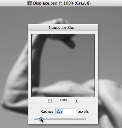
Run a slight Gaussian Blur (Filter > Blur > Gaussian Blur). We’ll be running a Displace filter using this image as our displace map, and a too sharp displacement map looks harsh and fake- a little blur takes care of that. Save and close Displace.psd.
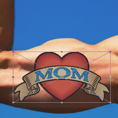
Step 3
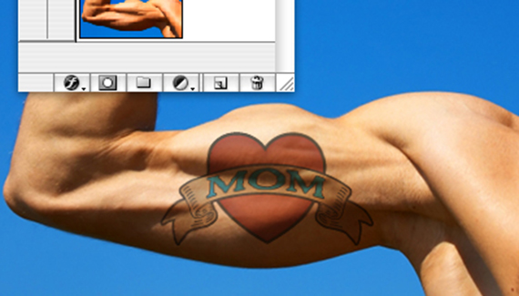
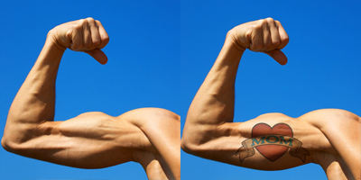
Place the tattoo artwork- this is an Illustrator file of mine. Size it to the muscle and hit OK to place.
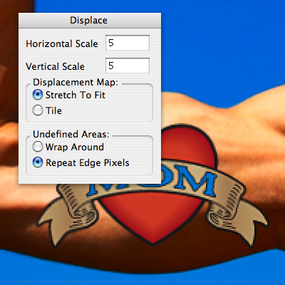
Step 4
With the tattoo layer selected, go to Filter > Distort > Displace. There’s two steps to this filter- first, type in the amount of horizontal and vertical scaling you want Photoshop to perform. I used 5 for this example- your mileage may vary. Next, select the Displace.psd file as your displacement map, and hit OK.
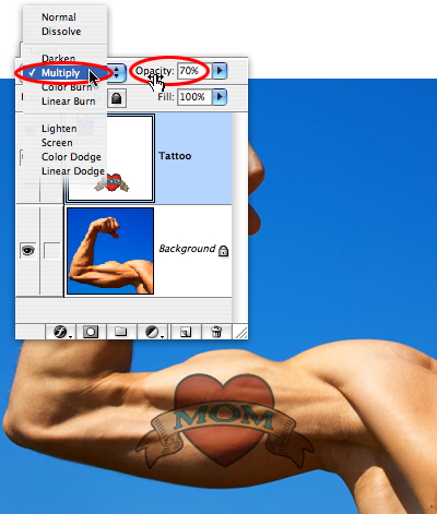
Step 5
For the final step, set the Tattoo layer blending mode to Multiply, and reduce the opacity to show a little of the skin texture. A great way to get “an interesting past”- without the needles.
Thank you so much for this tutorial. I have used it once to play with and now I ind myself using it again to place a logo on a golf ball. And I must say the same procedure works great! Thank you so much again!
hey this worked great although when i set it to multiply, all the white in the picture gets taken out.
hey this looks cool, but when i tried it, i got up to the ‘open displace’ file but it didn’t change back to colour. do i do that manually then try it again or is it supposed to be auto?
Thank you, great tutorial! Works well.
You changed it to greyscale then its colour on next image. Is this a mistake?
You may also want to use the free transform tool and then skew it around the body part.
no coment ..perfect