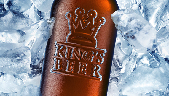
Instead of using a displacement map, here’s another method for taking a custom file and distorting it to match a background image.

Instead of using a displacement map, here’s another method for taking a custom file and distorting it to match a background image.
A clever technique & a great effect! Creating a unique filter for the glass filter is a killer tip!
I have tried looking for a suitable bottle for this effect…but i have been coming up short…the one bottle i did find doesn’t have a background that allows the effect to really shine through correctly…
where did you find that bottle??
are there any good, free Stock sites out there?
Yeah I also couldn’t get the effect. Thanks anyway though
I actually found this image on Fotolia.com.
Nice!! I definately prefer doing that to a displacement map…KOOL effect.
Hello,
Just wanted to say VERY nice tutorial !!! I really enjoy all your tutorial that you post up.
thx Corey, nice tut 🙂
wow! very nice tutorial and very good work you’ve done here, how ever, for us youngsters it’s often a problem finding good images because the really good images are only to be fund at stock sites. if you could put up the pictures you use in your tutorials I bet there would be a lot of happy users! Sincerely, Martin.
Hi!
Great Tutorial.
But sadly it doesn’t work that well with my files. Maybe I soften the logo too much or less.
Can you tell us how much you softened it for the glass filter? I mean should we notice, that it got softened or is it just a little bit? Know what I mean?
Here are my files:
http://img365.imageshack.us/img365/9558/bottleglassfilterar1.jpg
http://img181.imageshack.us/img181/2729/bottleicyem1.jpg
Well, great look on your end result… Perhaps there is too much of refrection, which I mean that it could have less of emboss, but that is, like you said, a matte of taste, you showed exactly where and how to do it.
Great tutorial.
Keep it up, Corey!
Márcio Guerra
P.s.- Just one last thing, I read the comments, you mentioned fotolia, I tried to look there, but, pehaps because I wasn’t registered I couldn’t find this photo, however I am just going to leave a sugestion. If you use pics from some sites, and don’t know if they support you on these tutorials, but, if you don’t mind, if the photo used was sponsored or so, or if you don’t mind, please try to always say where it comes from… Please… Eheheh Well, but only if you don’t mind and feel that it might help some of us finding it… Thanks!
Awesome! Thanks Corey. I work for a promotional products company and always have to add logos to blank products. This method also works really well for creating a debossed (recessed) logo on items. We manufacture those silicone bracelets (like the Live Strong ones Lance Armstrong sponsors) and this method works better than anything I’ve done in the past. Any other tips you have for stuff like this would be awesome to have.
Thanks again!
Tim
@Márcio Guerra:
Try this one: 😉
http://de.fotolia.com/id/5863852
try here with bottles http://www.sxc.hu
free stock images
Cheers
Very frustrating. I’ve tried different color liquids, different thickness fonts, distortion cranked up to the limit and smoothness of 1 and I don’t even approach the level of embossing the Corey gets. I must be missing something even though I’ve watched the video six times. At full distortion and smoothness 1, my logo barely lifts away from the bottles.
Corey
Great tutorial! I created my own logo and saved it as a GIF but it will not work. can you help?
Thx
Immie
can part of an object or picture be faded instead of the whole thing
it was good realy good made me want to whatch it again but then i didnt but it was still good
-great job!-
love
john freeman
yes i am a free man
what about it
wana fight??>?
i dont get it, im very sorry, the video was so awesome, but when the time i do it by myself, all i can say is DAMN, why i cant do emboss like in the video, even me, i play the distortion etc., by still, i done a big different. Please to the eXecutive, say the real magic here in your tutorial. Thanks. -nap philippines
Hi,
Is there a tutorial on how to get the logo that you start with? I have Windows also and that makes it difficult to follow along. My logo is black text on a trasparent background but when I drag it over onto my bottle the text doesn’t turn white after the applications. It stays black and it looks like the trasparent background is there somehow and it turns white instead. Does the logo sound like the problem or is it my follow along skills?lol Thanks!
Great little tutorial and worked first time for me, i put a logo onto a plastic screen on an object and looked great.
thanks
Awesome! Thanks. Makes this so simple.
Its a great tutorial. Was really thinking for such tutorial for my current work. you saved my time. i just did the steps, and got a great result.. Thanks a lot. You Rock.
Sathish Sampath
simply, AWESOME !
The embossed look is done perfectly. I like how the final product looks. I’ve been trying to design a logo somewhat like this (in essence, of course ) for myself and it was a disaster! I didn’t manage to get it looking right. It was a little bit… off somehow. Finally, I decided to use the professional services of an online logo design site instead (http://www.logodesignplanet.com) and got the logo I wanted at an affordable price and fast too, within 24 hours. I did provide this link for reference and inspiration to my designer as I liked how yours look. I’m not going to design a logo without any professional help anytime soon though it’s fun. And liberating. Haha. Cool tutorial, by the way.
Great Great Great !!!
Very good tutorial.
Good work man 🙂
Excellent Tutorial !! Very Easy to understand.
I tried every steps and finally made it !!
Hi Flo. Never said thank you. Thank you! Lucky guess I came back here so much later. Thank you again!
Márcio Guerra