

This week we are going to look at creating a text effect using the new scatter brush option. This effect is simple to create and its not limited to text , you could create some great background effects with this technique.
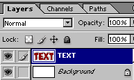
Start with some text on a new layer.

Render the type so we can modify it freely.
Select quickmask mode.
Under brushes, choose one of the presets that use the scattering option.
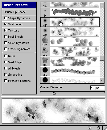
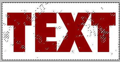
Pain through the text using the brush.

Press the “Q” key to switch off the quickmask. You will now see a selection.
You will need to inverse the selection. Ctrl/Cmd+Shfit+I
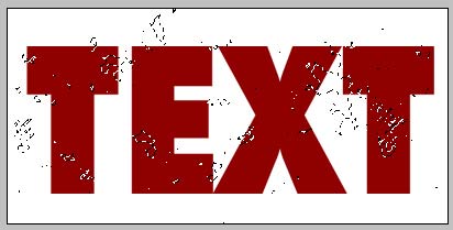
Press the delete/backspace key to cut into the text.
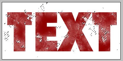
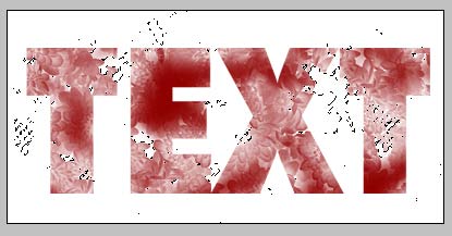
If you want a stronger effect press the del key again. Here I pressed it 3 times.
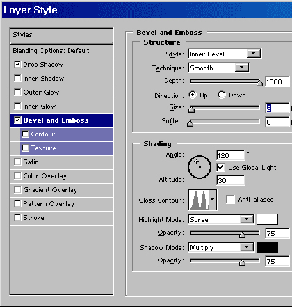
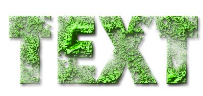
Add a standard drop shadow in the layer styles and choose a bevel similar to shown. Be sure to change the gloss contour.
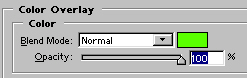
Change the color overlay to a bright green color.
And here is our effect!
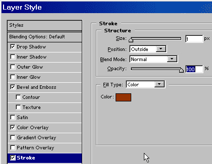
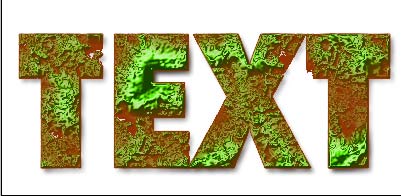
If you want to go a step further add a 1 pixel stroke using layer styles.
This creates a very interesting effect.
Experiment with this effect and see what you can come up with. Terrain maps for 3D come to mind.
See you at the café www.photoshopcafe.com

nice effect but i don’t like the end result.. the brown colour spoils it
k this tutorial isnt complete… what brush did you use..?
please tell more details…
I like this sit Its so beautiful
Yikes, Gurk – Use a different color then.
Good job on this tutorial. I had fun playing around with it. I actually ended up liking just having the green part without the solid color behind it. Very cool effect. 😀 ~ZeroGrafics
Wow… The toxic waste effect is really cool but the color should be more intense, that’s what I think. It actually inspired me for my logo design and I got my designer from LogoDesignPlanet.com to design a logo incorporating elements found from your tut. It came out better than expected as I thought it would be difficult to look strong and corporate but it looked really polished. Even my friends who were skeptics at first were blown away by how the logo design turned out. I got to thank you for posting this tut as I did show to my designer for reference to how I want it to look like. Thanks heaps!
Cool Nice work, i lik it…