
Color Theory 101, Part 3
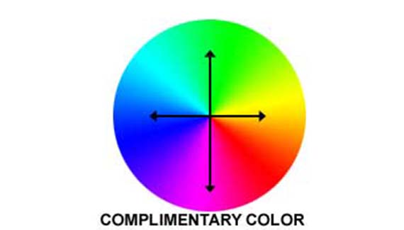
Ok, so we have now talked about colors that are similar. Now let’s talk about colors that are disimilar. To do so, let’s take another look at the color wheel.
Look at the image above and notice that the arrows point in opposing directions. This is demonstrating the concept of complimentary colors. First of all, consider the color directly across from any other color as being completely opposite. They are as disimilar as you can get. The theory behind this concept is that you have colors so different that they compliment each other like a symbiotic relationship. One color compliments the other. That is the bare-bones version of the theory. You get combinations like green/purple or blue/orange. How this is works is that you can have tension come out with your color. Instead of having a peaceful feel, you get a degree of contrast or conflict. This of course does not mean that it’s a bad thing. Contrast is a good thing, if that’s what you are going for. Take a look at the next image.

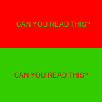
Here you have red stripes against green stripes, or the opposite if you like. Notice how the two colors are fighting for your attention? The red one sort of wins out, but that is because it is a warm color. Warm colors are considered to be “advancing”. So what they do is appear to jump out at you from the image. This is especially true if you place them against an opposing cool color.

Here you have another version using orange and blue. Yellow and blue also works. You’ll see a lot of web sites using this combination. My own site uses this. I use orange color against a monochromatic blue color scheme to draw your attention. It sort of jumps out at you. It sticks out like a sore thumb so to speak. But it also compliments the layout and adds a little spicey spice. Enough cliches? Ok.
Now let’s talk about good ways and bad ways to use complimentary colors. One great way to do this is when discussing type. Why is type so important on web pages, and why does it matter what the color of it is? Well, because you have to be able to read it, right? So what if I was to have an all orange site that used blue text? It would looke horrible for one, and you would have a heck of a time trying to read the text, unless I made it large and extremely dark. The same goes with red/green combinations or red/purple combinations. They just hurt your eyes, unless you use the warm color as the text against the cool, complimentary color background. Take a look below.
Can you see what I mean?
Now remember that color theory is a “THEORY”. That means that it is not written in stone. I am by no means a color theory guru. I encourage you to go out and learn more about color theory. There are sources on the web, if you search for them, or you can buy a book. I myself sometimes think it is kinda cool if a designer steps out of bounds so to speak and uses a non-traditional color scheme. But please don’t go out and make a red page with green text on it in a 7 point pixel font. We can’t read that! What you can do is experiment with these techniques on your own, and see how things feel and look. Always keep these basic concepts in your head, and you will be better off for it. Next week we will discuss why McDonalds and Burger King use orange and red in their signs’ color schemes. You’ll have to tune in for that. Go out and surf the web, making note of how designers use color. What sites do a good job and what sites do a bad job? You now have at least some power to decide.

Considering that this tutorial explains complimentary colors as opposites on the color wheel, the choice of colors in your graphic examples is questionable. Cyan compliments red, yet you chose green to do it in the first example. The second example shows orange instead of green complimenting the magenta stripes. The third graphic repeats the error of the first graphic.
Good explanations. Bad graphic examples.